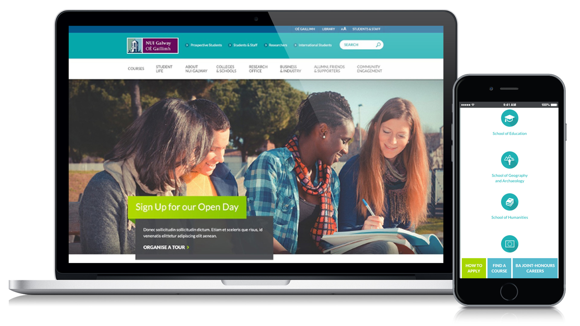
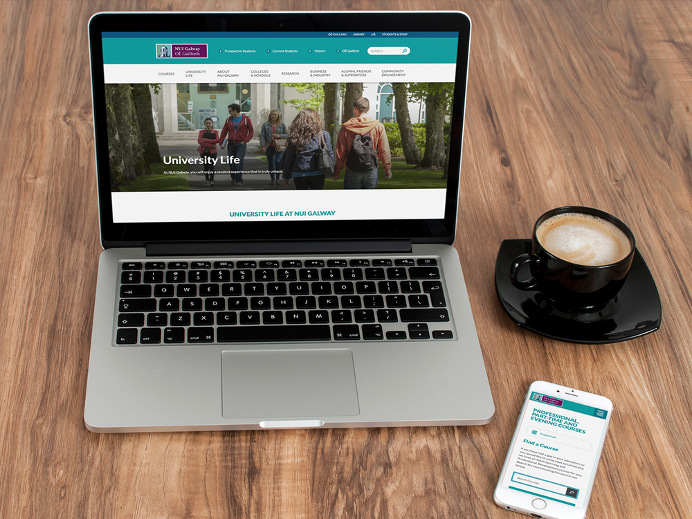
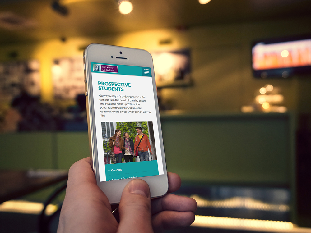
NUI Galway required a revitalised website that represented it's proud 170 history yet also connected with today's students – Irish and international – plus communicated the breadth of courses and research opportunities at the institution.
The requirement was to review the existing site, reorganise the diverse content from each of the schools and fundamentally improve the user experience to be more consistent and uniform.
Through comprehensive liaison with the multiple stake holders, a revitalised architecture was devised that united the disparate site functions into a coherent content structure, that is straightforward for a user to navigate and find the information they need with ease.
Adhering to Jacob Neilson's '10 Usability Heuristics for User Interface Design', a series of ordered page templates were constructed to accommodate each college and school's personnel profiles, course details and events calendar. I purposely discussed the requirements with each department to ensure the template was appropriate for their specific needs. As content for each section is managed by different individuals in each college, platform conventions and upload styling needed to be robust to ensure a consistency across the website.
Dynamic wireframes were shared to test user flows. Audience personas are diverse ranging from school-leavers and their parents to post-grad researchers and business interests. Each audience were considered in depth and the site architecture insured there needs were accommodated.
Previous iterations of the site suffered from erratic and inconsistent content labelling and action phrasing. Content managers were guided on image, copy and call to action rules. Strict colour coding and button styling ensure optimum user understanding.
Through working with the stakeholders and constructing a site that addressed their ways of working, we have created a digital presence for the university that is more easily navigated, infinitely more user friendly and more fitting representation of the historic institution.
Bounce rates and engagement metrics have improved dramatically, but the best attestant to the new site's success is the manner in which each of the content managers has been able to maintain polished and consistent looking site with ease.


